Help Center
Manage display on mobile
Contents added on a site have a default display on mobile and tablet.
With BackBee it is possible from your computer to:
- Choose what content will be visible on a mobile device
- Choose how to display these contents on a mobile and a tablet
To set the display of your content on mobile and tablet:
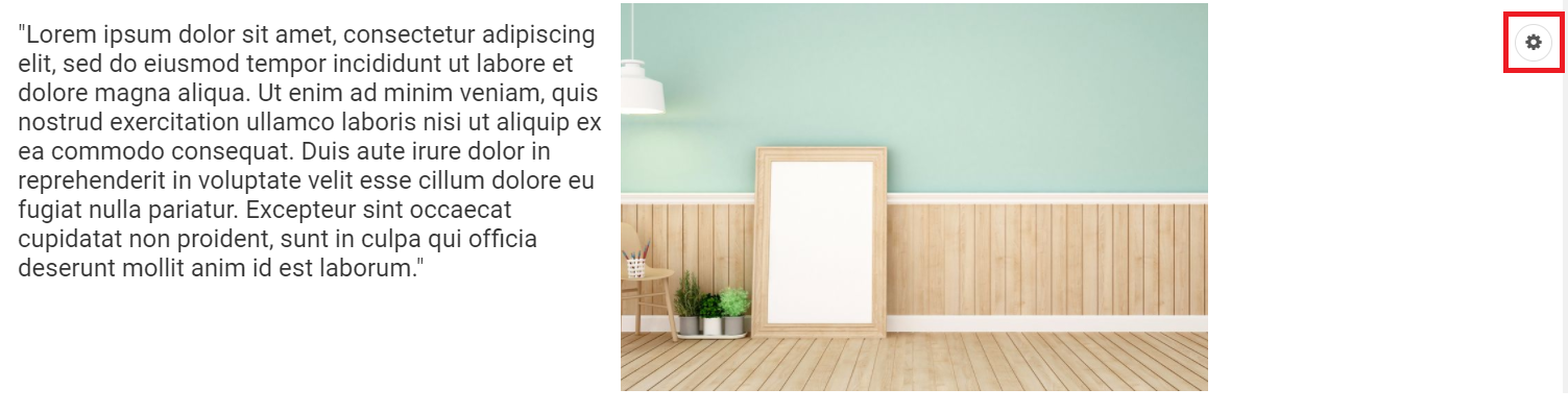
- Go to the content section that needs to be organized
- Tap on the settings icon of the section
The options popup appears.
Tap the "Mobile View" tab.
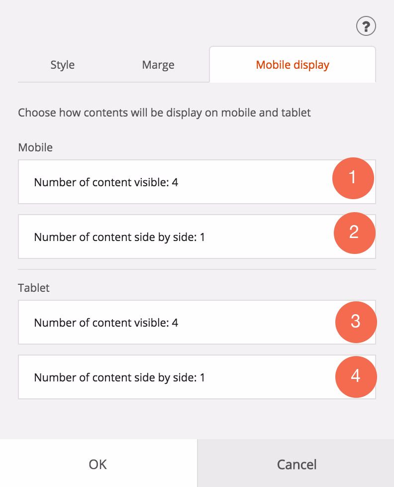
The options are:
1. Displays between 1 and 4 content blocks on a telephone for that particular section
Example: selecting "1" only the text will be displayed on the mobile
2. Allows to display between 1 and 4 content blocks side by side on telephone for that particular section
Example:
If I choose "1", the text and image will be one below the other on the phone
If I choose "2", the text and image will stay side by side on the phone.
3. Displays between 1 and 4 content blocks on a tablet for that particular section
Example: By choosing "1", only the text will be displayed on the tablet
4. Allows to display between 1 and 4 content blocks side by side on a tablet for that particular section
Example:
If I choose "1", the text and image will be one below the other on tablet
If I choose "2", the text and the image will remain side by side on tablet
Read also
Work with the mobile device Editor
Manage your SEO
Manage your Pages
Work with the Editor
Manage your Images
Adjust your Design
Manage your Site